Chakra UI Review (2026): Pricing, Features & Honest Verdict
TLDR
Chakra UI is an accessible, composable React component library with style props, dark mode, and a focus on developer ergonomics. Best for: frontend developers who want fast prototyping with accessible defaults. Price: free (open source), Pro components from $149. Rating: 7.6/10
What is Chakra UI?
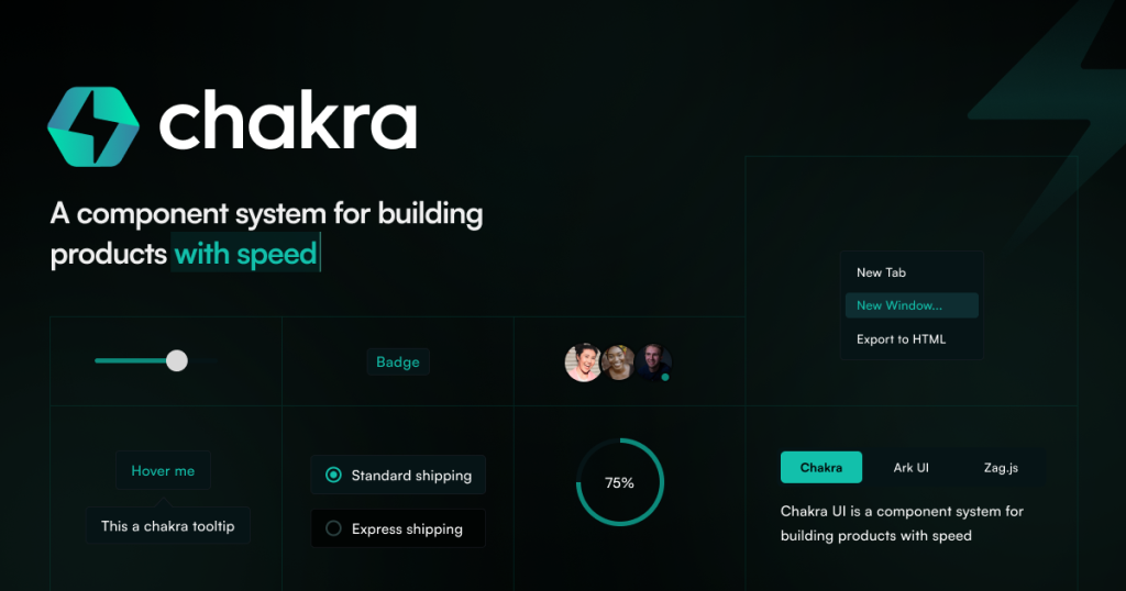
Chakra UI is a React component library built around accessibility and composability. Every component follows WAI-ARIA guidelines out of the box, which means you get proper keyboard navigation, screen reader support, and focus management without extra effort. The library’s signature feature is its style props system, which lets you apply CSS directly through component props rather than writing separate stylesheets.
With 38,000+ GitHub stars, Chakra has established itself as one of the most popular React UI libraries. Version 3 (released as a major rewrite) introduced a zero-runtime CSS engine called Panda CSS under the hood, moving away from Emotion. The library emphasizes doing fewer things well rather than trying to cover every possible UI pattern. You get solid foundational components and the flexibility to compose complex interfaces from simple pieces.
Key Features
Style Props System: Instead of writing CSS classes or styled-components, you pass style values directly as component props. Padding becomes p={4}, background color becomes bg="blue.500", and responsive values become arrays like w={["100%", "50%", "33%"]}. This inline approach keeps styles co-located with components and eliminates context-switching between files. It takes some adjustment if you are used to traditional CSS, but most developers find it faster for prototyping.
Accessibility First: Every interactive component handles focus trapping, keyboard navigation, ARIA attributes, and screen reader announcements. Modals trap focus correctly, dropdown menus support arrow key navigation, and form inputs announce errors to assistive technology. This is not an afterthought; it is the core design principle. You would need to spend significant effort replicating this level of accessibility with unstyled primitives.
Theme System: Chakra’s theme is a JavaScript object that defines colors, spacing, typography, breakpoints, and component-level styles. You extend the default theme to customize your brand without overriding individual components. The system supports color modes (light/dark) with a single toggle, and theme tokens are available as CSS variables throughout your application.
Composable Components: Complex components like menus, accordions, and tabs are built from smaller, composable parts. A Menu is assembled from MenuButton, MenuList, and MenuItem components rather than configured through a monolithic props API. This pattern gives you control over rendering, positioning, and behavior without fighting abstractions.
Layout Utilities: Stack, Flex, Grid, SimpleGrid, and Container components handle common layout patterns. SimpleGrid is particularly useful: you specify the number of columns or a minimum child width, and the grid adjusts responsively. These layout components reduce the amount of custom CSS you write for page structure.
Design Tokens: Colors, spacing, sizes, shadows, and radii are defined as tokens in the theme. Using tokens like blue.500 or spacing.4 ensures consistency across your application. When you update a token value, every component using that token updates automatically.
Pricing
The core Chakra UI library is free, open source, and MIT licensed. All foundational components, hooks, and theming capabilities are included at no cost. Chakra UI Pro offers pre-built, production-ready component patterns (marketing sections, application shells, e-commerce layouts) starting at $149 for a personal license. The Pro components are optional and aimed at teams that want to skip building common page patterns from scratch.
Compared to MUI, which gates its advanced data grid behind a $180+/year license, Chakra keeps all core functionality free. The Pro offering is more about saving time than unlocking features.
Pros
- Best-in-class accessibility defaults across all interactive components
- Style props system makes prototyping significantly faster than traditional CSS workflows
- Composable component architecture gives fine-grained control without fighting abstractions
- Clean, readable API that new team members pick up quickly
- Active community with 38K+ GitHub stars and regular updates
Cons
- Fewer built-in components than Mantine or Ant Design (no form library, charts, or rich text editor)
- Style props add verbosity to JSX, making templates harder to scan on complex pages
- Version 3 rewrite introduced breaking changes that slowed migration from v2
- Performance can suffer on pages with hundreds of styled components due to runtime overhead
| Plan | Price | Plan Features | Best For |
|---|---|---|---|
| Open Source | Free | All core components, hooks, theming, dark mode, accessibility features, TypeScript support | Most developers |
| Pro (Personal) | $149 | Pre-built marketing sections, app shells, e-commerce layouts, single developer license | Solo developers wanting pre-built patterns |
| Pro (Team) | $349 | All Pro components, unlimited team members, Figma files included | Teams shipping faster with pre-built layouts |
Who is Chakra UI Best For?
Chakra UI works best for frontend developers and small teams who prioritize accessibility and developer experience. If you are building a SaaS product, marketing site, or internal tool and want components that are accessible by default without manual ARIA wiring, Chakra removes that burden. Freelancers appreciate the speed of style props for rapid client work.
Teams building data-heavy enterprise applications with complex tables, charts, and form management will find Chakra too minimal on its own. You would need to add separate packages for forms (React Hook Form), tables (TanStack Table), and charts (Recharts). If you want all of that included, Mantine or MUI are more complete choices.
Alternatives
Mantine
Mantine offers everything Chakra does plus built-in form management, notifications, a rich text editor, and charts. It is the batteries-included alternative for teams that want fewer dependencies. The tradeoff is a larger API surface to learn. Best for developers who want maximum features in a single library.
MUI
MUI (Material UI) has the largest ecosystem in the React component space with thousands of community resources, templates, and integrations. It follows Material Design, which provides strong visual consistency but can feel rigid. Advanced components (data grid, date pickers) require paid licenses. Best for teams that need a massive ecosystem and do not mind Material Design.
Ant Design
Ant Design is an enterprise-focused React library with 60+ components, a complete design system, and strong conventions. It is more opinionated than Chakra and better suited for large-scale admin panels and dashboards. The bundle size is larger and customization requires more effort. Best for enterprise teams building data-heavy internal tools.
FAQ
Is Chakra UI good for production applications?
Yes. Chakra UI is used in production by companies ranging from startups to larger organizations. The accessibility defaults and TypeScript support make it suitable for production. Performance is adequate for most applications, though extremely component-heavy pages may benefit from careful optimization.
Can I use Chakra UI with Next.js?
Yes. Chakra UI supports both Next.js Pages Router and App Router. Version 3 with its zero-runtime CSS approach works well with server components. There are official setup guides in the Chakra documentation for both routing approaches.
How does Chakra UI handle responsive design?
Chakra uses responsive array syntax and object syntax for breakpoint-based styling. Instead of writing media queries, you pass arrays to style props: w={["100%", "50%", "33%"]} maps to mobile, tablet, and desktop widths. Custom breakpoints are configurable in the theme.
Chakra UI Pros & Cons
What We Like
- Best-in-class accessibility defaults across all interactive components
- Style props system makes prototyping significantly faster than traditional CSS workflows
- Composable component architecture gives fine-grained control without fighting abstractions
- Clean, readable API that new team members pick up quickly
- Active community with 38K+ GitHub stars and regular updates
What Could Be Better
- Fewer built-in components than Mantine or Ant Design (no form library, charts, or rich text editor)
- Style props add verbosity to JSX, making templates harder to scan on complex pages
- Version 3 rewrite introduced breaking changes that slowed migration from v2
- Performance can suffer on pages with hundreds of styled components due to runtime overhead
Chakra UI FAQ
Is Chakra UI good for production applications?
Yes. Chakra UI is used in production by companies ranging from startups to larger organizations. The accessibility defaults and TypeScript support make it suitable for production.
Can I use Chakra UI with Next.js?
Yes. Chakra UI supports both Next.js Pages Router and App Router. Version 3 with its zero-runtime CSS approach works well with server components.
How does Chakra UI handle responsive design?
Chakra uses responsive array syntax for breakpoint-based styling. Instead of writing media queries, you pass arrays to style props that map to mobile, tablet, and desktop widths.
What is Chakra UI?
Accessible, composable React component library with style props, dark mode, and theming. Open source with optional Pro components from $149.
How much does Chakra UI cost?
Chakra UI pricing starts at Free (open source). A free plan is available.
Is Chakra UI worth it?
Chakra UI excels at accessibility and developer ergonomics. The style props system and composable architecture make it fast to build with, and the accessibility defaults save hours of manual ARIA work. It is lighter on features than Mantine, but that simplicity is a feature for teams that prefer composing their own stack. We rate it 7.6/10.